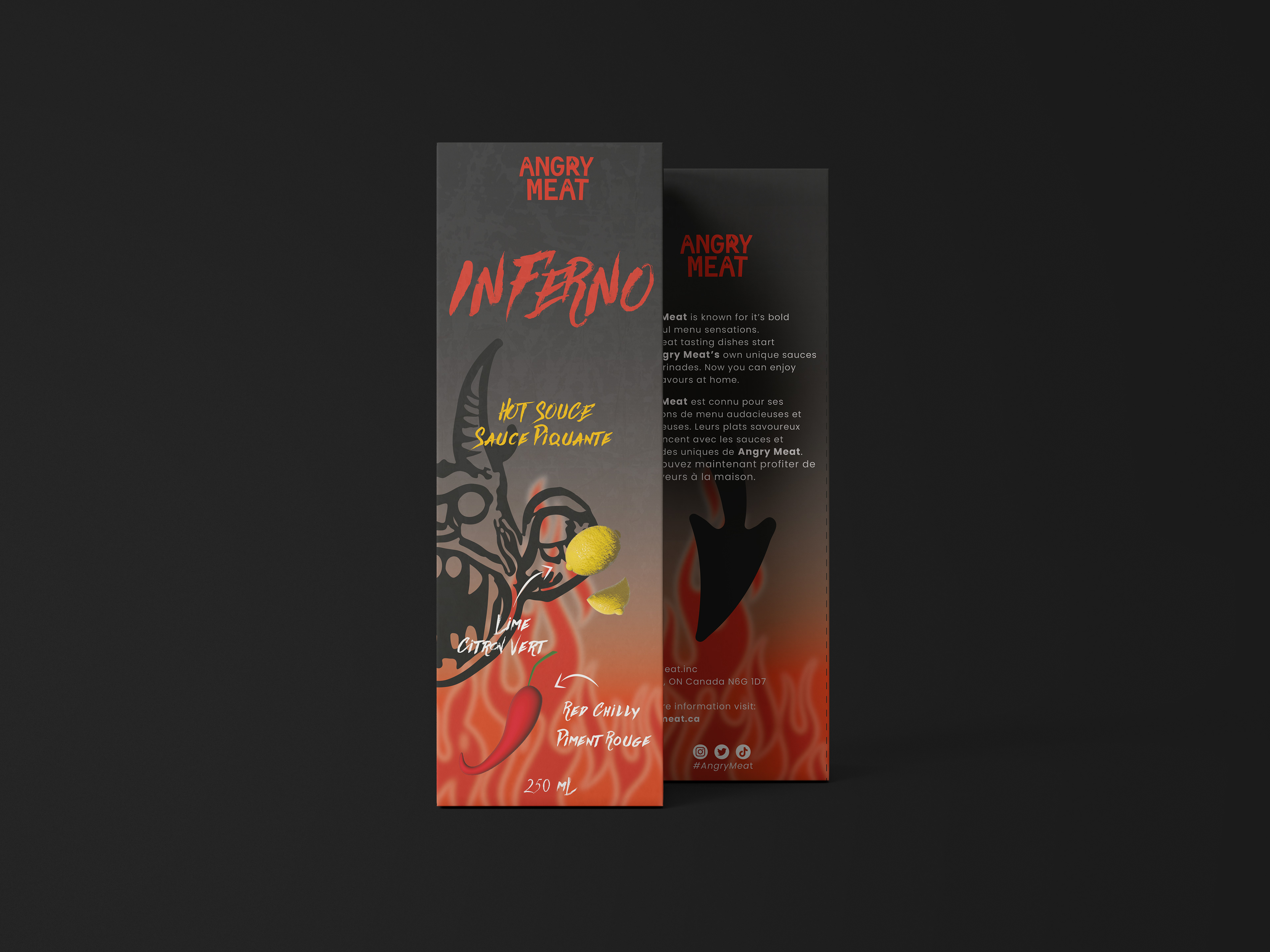
Packaging Design
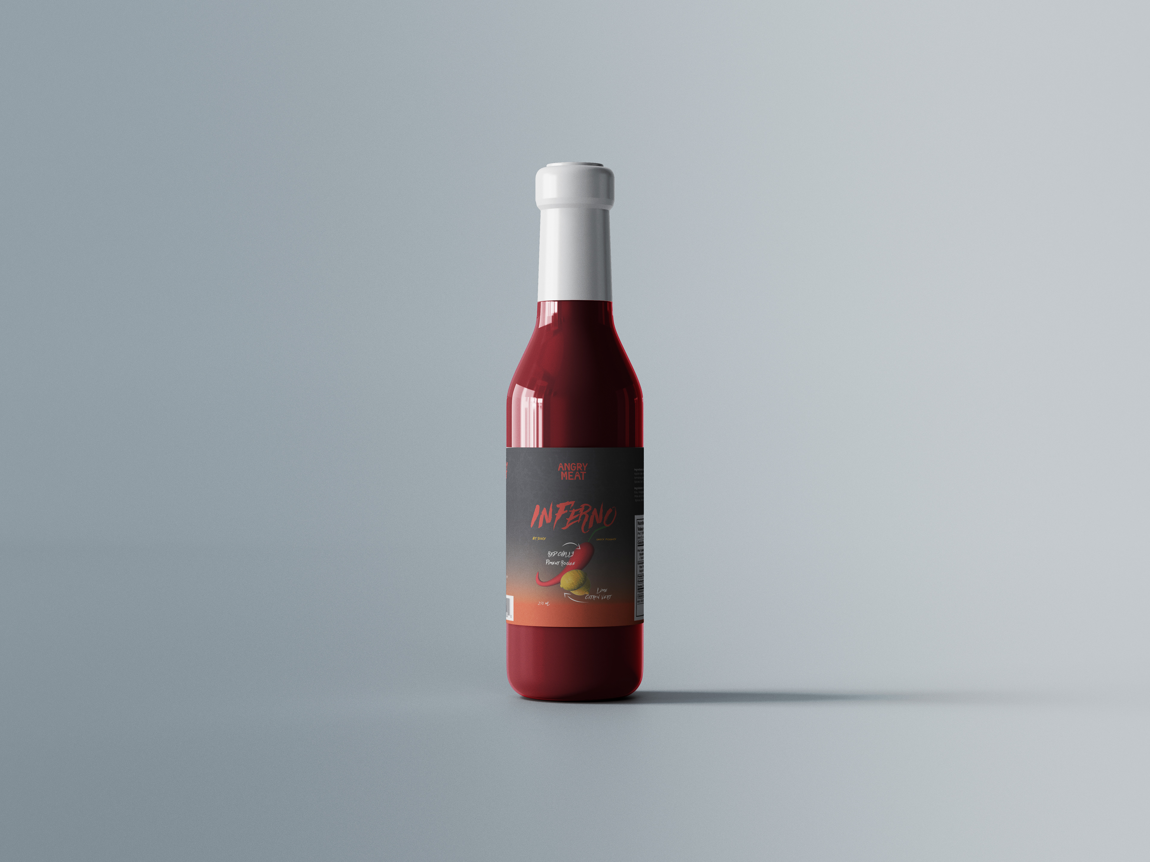
Label Design
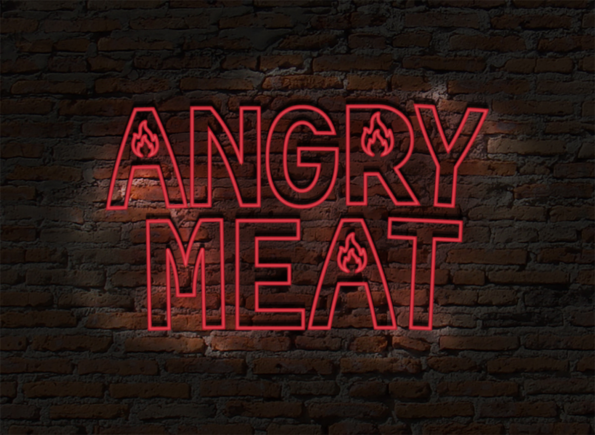
Sign
Logo
For the “Inferno” lemon and red chili hot sauce, I aimed to illustrate the lemon and red chili in 3D to make it easier for customers to identify the key ingredients. These elements were integral to the design. I used a color palette of reds, oranges, yellows, blacks, and whites to achieve high contrast and enhance legibility. To make the design creative and intuitive, I included arrows and labels. Since the labels were also in French, I balanced both languages effectively.
